Types of graphs and what they are used for:
Each graph below has a visual example, the name for the type of graph and a definition of what they are used for decided by our class.
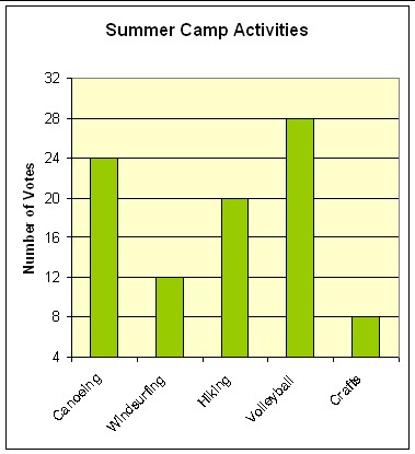
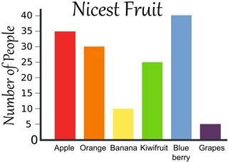 This is a bar graph. We use bar graphs to compare more than one thing in the same category. E.g. eye colours - blue, green, brown, hazel, or favourite sports - hockey, basketball, soccer, tennis. We usually have a scale with WHOLE numbers in this type of graph.
  This is a pie chart. We use pie charts to compare more than one thing in the same category. E.g. vechiles across an intersection - cars, buses, walking, trucks. We display the data using fractions or percentages.
  This is a pictograph. We usually use pictorgraph to represent more than one thing in the same category. E.g. food types. We use pictures that represent more than one (check the scale/key) and therefore usually the data is quite large. e.g. one picture may represent 1000.
  This is a line graph. We use line graphs to represent one category/item over time. We always plot points on intersections or cross sections before joining them up using the line. We would use a line graph for data such as: weather, interest, company stocks, etc.
 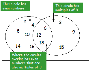 This is Venn Diagram. We use it to compare 2 things (2 circles) - if we had 3 circles you would be comparing 3 things, etc. We look at the similarities (middle) and the differences (independent circles). We could use this to compare data such as: factors of a number or multiples of a number, questionairres/surveys.
 Analysing sets of data:
Mean - average (add all numbers together then divide by how many numbers you had in the set of data)
Median - middle number (sort your data from smallest to largest, the middle number is the median if you have an odd set of numbers. If you have an even set of numbers you need to add the two middle numbers and divide by 2 - average).
Mode - The number that repeats the most (sometimes you can have more than one number, sometimes you won't have a mode).
Range - Comparing/subtracting the largest number from your data by the smallest number from your data.
https://www.youtube.com/watch?v=uydzT_WiRz4
Answering questions based on graphs:
1. Highlight key words - they often try to trick you!
2. Work out what method you need to do e.g. just read off the graph, add data, subtract data, compare
3. Solve the problem and write down your answer.
Creating our own graphs:
1. Choose the correct type of graph for the data you have.
2. Write a title for your graph.
3. Rule up the y and x axis.
4. Label the axis with subtitles.
5. Put the scale on both axis (you want to fill the page).
6. Disaply the data on your graph (NEATLY)
7. CHECK OVER YOUR WORK
Vocabulary:
diagram
|
A pictorial
representations/graph displaying data
|
data
|
Researched
information
|
scale
|
Using a set
measurement to space out your data on your x and y axis
|
Y axis
|
The vertical line
on a graph
|
X axis
|
The horizontal
line on a graph
|
title
|
The name/topic of
your graph
|
No comments:
Post a Comment